Introduction
Most marketing emails look the same. Logo, hero, button, wall of text. Not because the people sending them don't care - they just default to "good enough" when sending every week.
Great email design communicates clearly, fits the brand, and makes the reader keep scrolling. It doesn't have to be complex. Most of the best examples are quite simple.
Here are 7 real emails that get design right - and what you can take from each one.
1. Rapha — Ride Further (Black Friday)
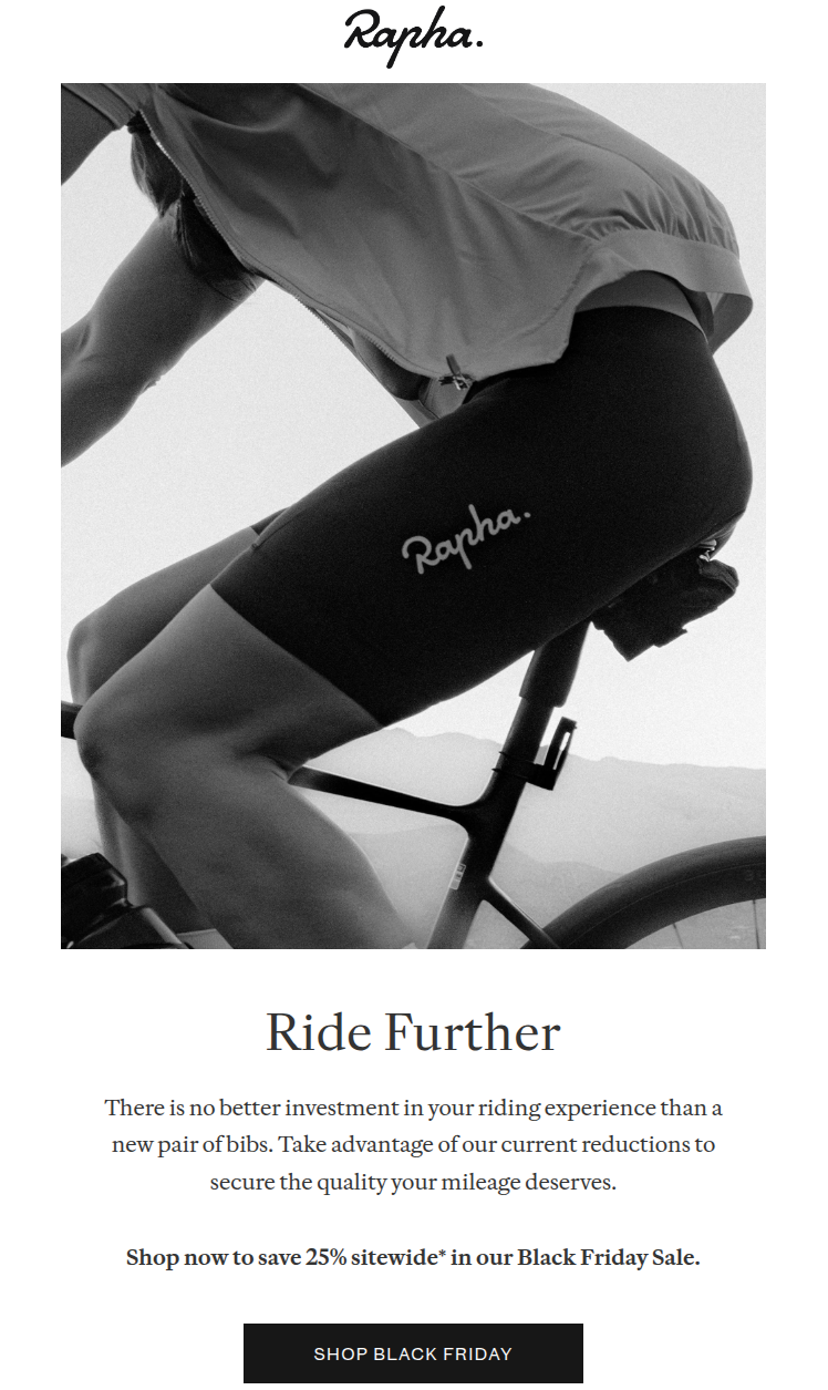
Rapha is a premium cycling brand making kit, clothing, and accessories for road cyclists who take the sport seriously. Their emails tend to match that reputation - confident, stripped back, and nothing like a typical sale email.
| Likes | Dislikes |
|---|---|
| Grayscale palette - photography carries everything | Nothing notable |
| Single CTA, early, unambiguous | |
| Strava in the social footer - they know their audience | |
| Footer gives three options: pause, preferences, unsubscribe |
The restraint is worth studying - grayscale palette, square buttons, minimal copy, one CTA. What's harder to replicate is the confidence to leave out the countdown timer, the urgency banner, and the secondary offer that most brands can't resist adding when a sale is on.
2. Touchland — Valentine's Day
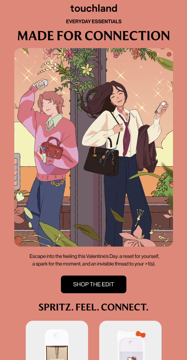
Touchland makes hand sanitisers in sleek refillable dispensers, with a focus on fragrance and design over the clinical end of the category. The brand positions itself somewhere between wellness and fashion, and their emails reflect that.
| Likes | Dislikes |
|---|---|
| Custom illustration instead of a product shot | "Shop the edit" CTA means nothing outside fashion circles |
| Generous padding - nothing feels cramped | |
| "Spritz. Feel. Connect." - three words, says everything | |
| Quiz link is a smart hook for non-buyers |
The spaciousness is a big part of what makes this work - every element has room around it, nothing competes for attention, and it reflects the calm mood the brand is building. A crowded version of the same email would kill it entirely.
3. Patagonia — Say Hello to Kaleido
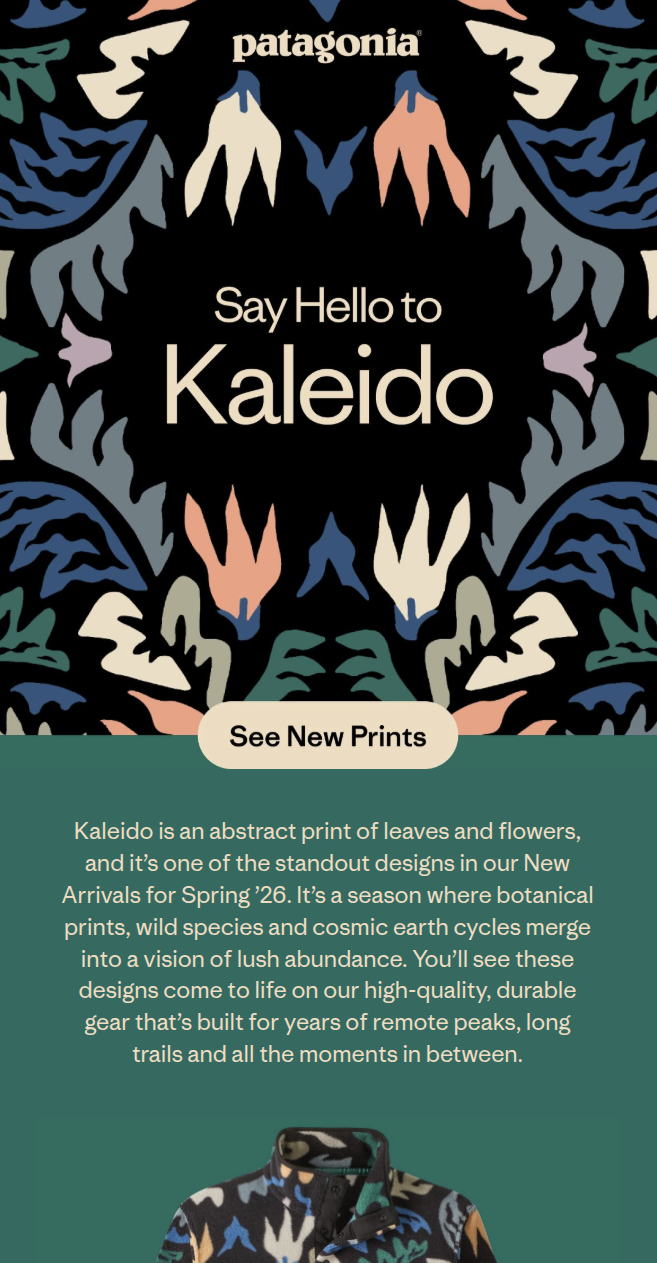
Patagonia makes outdoor clothing and gear, and has built one of the strongest brand identities in the industry around sustainability and authenticity. This email promotes a new print called Kaleido, and treats it like a gallery opening rather than a standard product drop.
| Likes | Dislikes |
|---|---|
| Hero leads with the print, not a model | Footer: light grey text on white - poor contrast |
| Deep teal and dark purple - a confident palette | |
| One product per row, consistent throughout | |
| "Making Kaleido" storytelling section mid-email |
The behind-the-scenes section midway through is the real standout - a photo of the designer's hands cutting paper shapes, a warm coral card, a Watch button. Promotional emails rarely stop to explain how something was made, and when they do it often feels tacked on; this one doesn't.
4. Flamingo Estate — Say it With (Good) Flowers
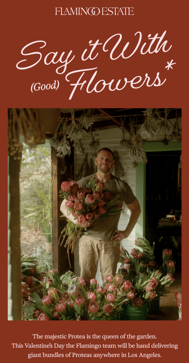
Flamingo Estate grows and sells flowers, food, and fragrance from a farm in California, with a brand built around slow living and natural abundance. Their Valentine's Day email feels more like a letter from that farm than a promotional campaign.
| Likes | Dislikes |
|---|---|
| Pink toile background sets the tone before a word is read | Some text sections could be tighter |
| Rich, saturated photography throughout | |
| Some images exist purely for atmosphere - no CTA, no caption | |
| Named the farmer, named the farm |
The photography carries most of the weight here - rich and saturated, it creates a mood before you've read a word, and generic stock photos would collapse the whole thing. The detail of naming the farmer and describing the farm is small but meaningful; it's what makes a brand like this feel real rather than performed.
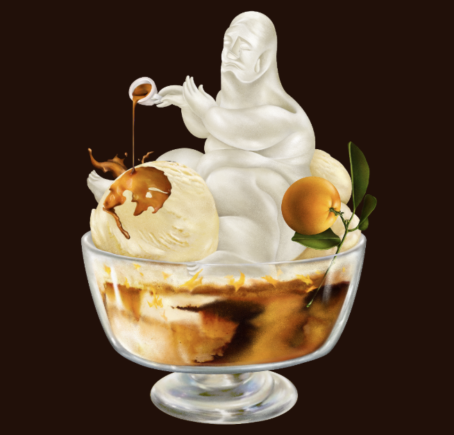
5. Soft Services — Affogato L'Orange Buffing Bar
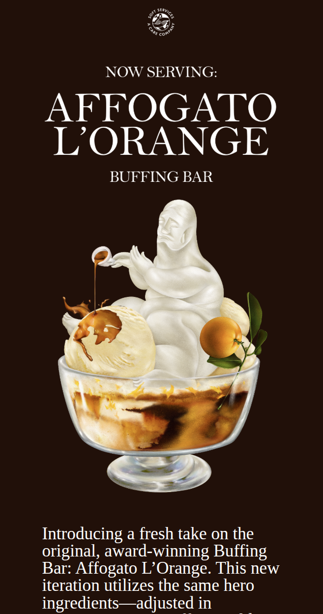
Soft Services makes premium body care products - exfoliants, moisturisers, body serums - with a focus on texture and sensory experience rather than clinical ingredient lists. Their Affogato L'Orange buffing bar launch email is built entirely around the product's scent profile.
| Likes | Dislikes |
|---|---|
| Espresso brown and warm gold - you almost smell it | Nothing notable |
| Surrealist hero image stops the scroll | |
| Products linked inline in the copy, no heavy CTAs | |
| "SONO SPECIALE!" - absurd, charming, completely on-brand |
The copy reads like creative writing rather than product description - "a dairy-free beige, like the shade of your favourite nut milk" is not a line that came from a standard brief. The inline product links instead of heavy CTAs are also worth noting; it makes the whole email feel like editorial rather than a catalogue.
6. Customer.io — Unpacked 2026
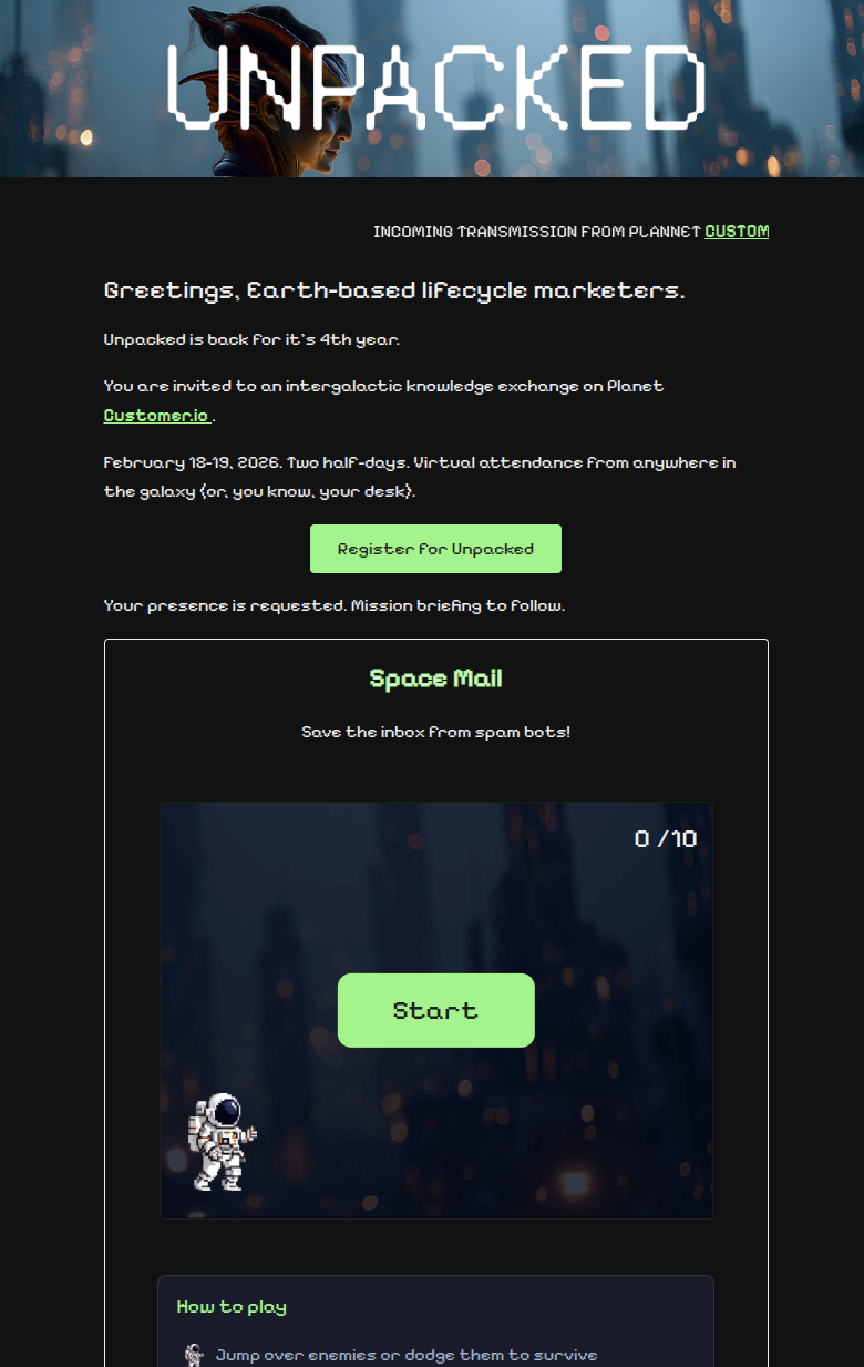
Customer.io is a marketing automation platform used mainly by SaaS and tech companies to send lifecycle emails, push notifications, and in-app messages. Their Unpacked 2026 conference announcement email has a fully playable game built into it.
| Likes | Dislikes |
|---|---|
| CSS-only game with a fallback for non-supporting clients | Unsubscribe styled same as social links - easy to miss |
| Near-black background, neon green, pixel font throughout | |
| Every line of copy stays in character | |
| The product is the campaign |
The game runs on CSS checkbox tricks with no JavaScript, which is why it works in Apple Mail and similar clients - with a graceful fallback for those that don't support it. The commitment to staying in character throughout is the other thing worth noticing: "Greetings, Earth-based lifecycle marketers" is not written by accident, and that consistency is what makes the whole concept land rather than just impress.
7. Benjamin Moore — April's Projects Start with Popular Neutrals
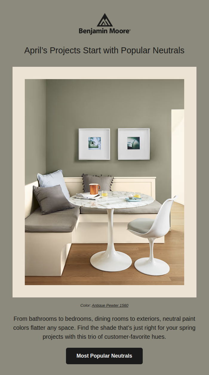
Benjamin Moore is a paint brand with over 3,500 colours in their range, sold through independent retailers across North America. This April email promotes their popular neutral shades - but with an April Fools' twist.
| Likes | Dislikes |
|---|---|
| Each section uses the featured colour as its own background | Nothing notable |
| Photography framed with white borders - looks like a mounted print | |
| "One More Thing..." payoff is genuinely earned | |
| Concept fits the product - you're inside the colour |
Using the featured colour as the section background is quietly smart product demo - you're not looking at a swatch, you're sitting inside the colour, which is a more convincing argument than any description could be. The April Fools' mechanic stays low-key and earns its payoff with the "One More Thing..." reveal; it's a good reminder that a seasonal hook doesn't have to mean a discount.
What these emails have in common
They're not all the same style. Some are image-heavy, some are text-only, some are bold, some are minimal. But they share a few things:
- They each have one job — one message, one ask. Not three products and a newsletter banner.
- Strong visuals — most use photography or illustration to anchor the email. The text-heavy ones use colour and type to do the same job.
- Copy that earns its place — when there is copy, it's working. "Spritz. Feel. Connect." is not filler.
- Restraint — they don't try to do too much, and nothing in them feels like it shouldn't be there.
Great email design isn't about following trends. It's about making deliberate choices that serve your audience and reflect your brand.
If your emails don't look like that yet, that's what we help with at Resonate Mail.